

10 Jun 2019 How to make engaging poster
I would like to share with you, with the permission of my client, the experience of designing the poster for the Italian gastronomical event Impasti a Gourmet. I would like to show you how effective cooperation with the graphics studio of our digital advertising agency may look like.
The client approached us requesting if we could do something with a poster, that someone created for the event organizer, on which the client participated. His logo was hard to find on the poster. Judge for yourself.
According to the client, the background was dark, and the logo was not close to their address. For a poster, the design had an impractical aspect ratio. It was not aesthetically pleasing to him as a whole.
We identified several poster shortcomings:
- Logos of the organizers are hard to find
- Nothing leads the reader’s eye
- The poster is too varied and therefore difficult to read
- The author used a lot of different fonts
- The photos were not of sufficient resolution for printing (it may not be so apparent on the web as in print)
- It is not known whether the author used the “Internet” photos, which could cause problems.
We have committed ourselves to the job. The side goal was to try out how different the result might look when a designer only does what he was asked for specifically, compared to when the designing is done by an experienced professional. In the latter case, to offer information as engaging as possible and making the poster as relevant as possible. Nevertheless, even during the first approach, we’ve made significant changes that contributed to better readability:
- We didn’t find the original high-resolution background image, so we used a new, lighter background. This change has significantly contributed to better readability.
- We have somewhat matched font sizes and line heights.
- The contents of the poster were moved so that the reader’s eye is guided from the heading “Impasti and Gourmet“, through the date, the venue, the “new doughs” (I nuovi impasti), the logos of the organizers to the additional information below. The result is shown in the figure.
A work of this quality is easy to come by from any average ads agency or mediocre graphics designer. The designer takes over the assignment and finalizes it by doing what the client requested. Quick and cheap job. Fortunately, our client was a perfectionist and in our case, in particular, willing to listen to the advice. Of course, he wasn’t entirely satisfied with how the poster looked, but he just couldn’t define exactly why it didn’t work.
How to make the poster easy to read, eye-catching, and therefore relevant
The new assignment was: “Make the poster the way you think it should look.” This was an excellent opportunity. Up to this point, the graphic designer probably did not think about why the client actually needed the poster. The client and I have, therefore arranged a really detailed interview. I asked even for things that seem unrelated to the graphics of the material. So I learned a lot of valuable information needed to create a striking poster.
The poster was supposed to hang in the companies organizing the venue and at the event itself. But they would also like to give something to the invited as a reminder not to forget. It is going to be a baking course for pizza chefs for free. An internationally acclaimed chef will show how to bake a super-delicious pizza from prepared dough. From each of the new kind of flour. The baking will than be followed by tasting and eventually a free discussion with the chef. Each participant will, in the end, receive a certificate of completion. This is a co-branding event. Client, the flour supplier, wants to promote new products (flour). The free course is, in turn, the organizer’s promotion of his paid classes.
Based on this information, I have tried to understand the issue as best as possible. I suggested to the client to make several versions of this promotion material, each for specific use:
- A2 sized poster that can be printed in any print shop.
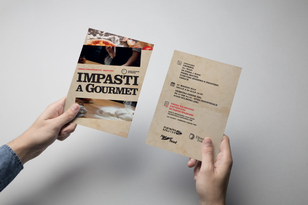
- Into hand, for potential visitors, a double-sided A5 flyer.
- For online invitations, chat-friendly version (to be displayed correctly on any mobile phone)
- Version for sharing on Facebook and other social networks.

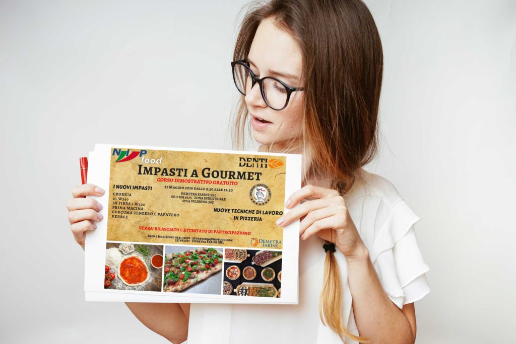
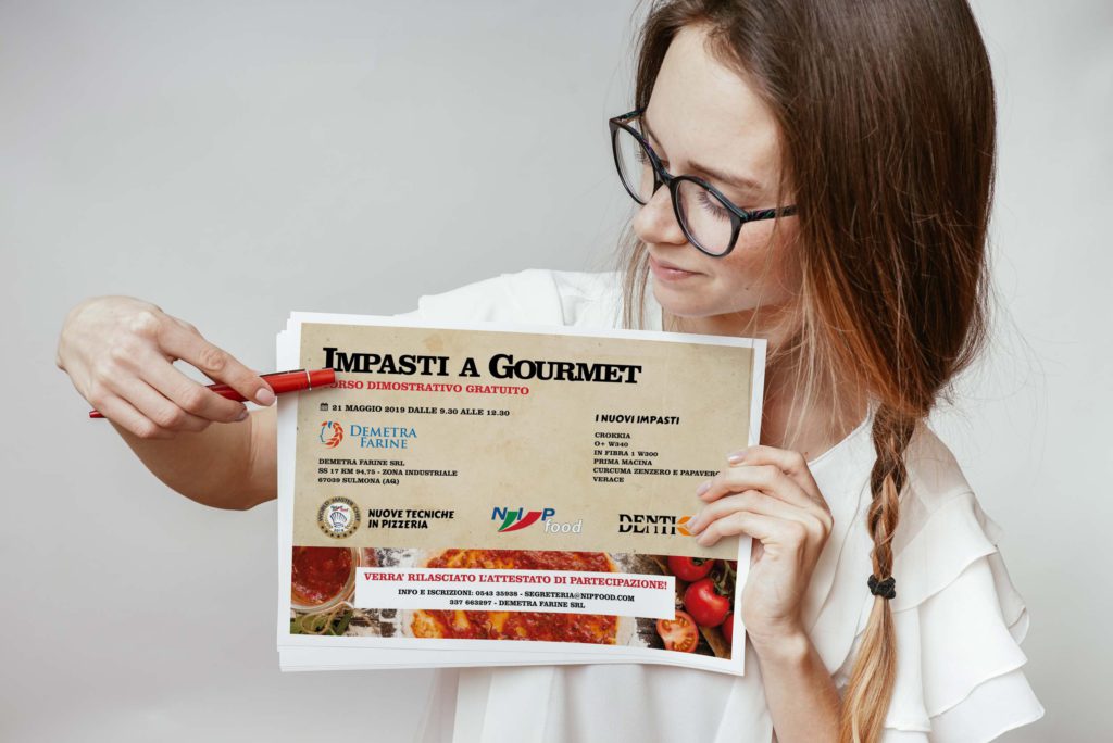
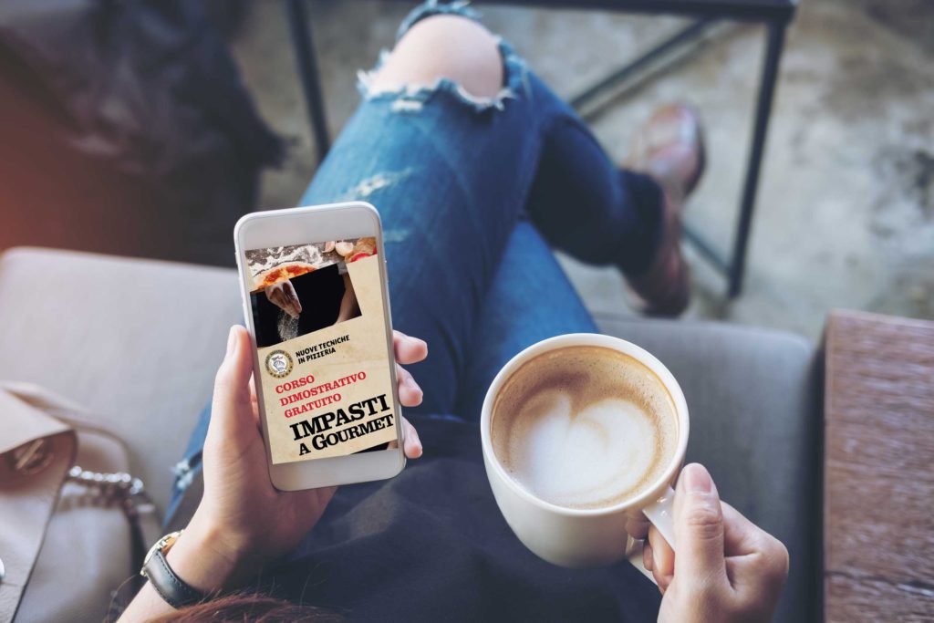
The most important thing for a potential visitor, considering a visit to an event, is whether he can gain valuable experience. For free. Of course, the most dominant on a poster is the title. The name of the event The Gourmet Doughs is therefore the biggest and can be seen from the furthest distance. The principal, contrasting photography above and below shows what the visitor encounters at the venue— the cook who is working the dough. This is a very professional photo. I have chosen to split it into two elements. Sprinkling flour and kneading the dough. The fact that an internationally acclaimed chef will attend the venue a potential visitor will know from the famous logo World master chef. These venues tend to be paid, so the title also contains clearly visible information that this training is free. Thus, even with the cursory look, percipient quickly realises it has something to do with the dough. The result will be pizza. It has been suggested by a beautiful photograph with food styling at the top.
All the other information is less critical. So it should be placed in a significantly smaller but still legible font on the poster. Hence, I lead the eye to the bottom of the poster, where the program is the first information. I’ve added the right icon, so the percipient will hopefully notice that these are the names of flours for making if the doughs. What follows is the date, location of the venue with the calendar icon, and the information about the certificate. The certificate at the end of the event is essential and valuable information and is accompanied by an appropriate figure. However, it would be a mistake to elevate it to the headline level. Therefore, I highlighted it with the colour already used on the poster — red.
The colour palette I used in the poster is straightforward. Only a few colours—clearly related to the theme of the event. The colour of the dough is the colour of the background. It is found in similar shades on both photos used: raw pizza dough, the tone of the paper, the richness of the wood and the colour of the dough at the bottom. Important text information, in black, is contrasting and easy to read. The second colour used is also found on fresh pizza—the red colour of tomatoes and tomato sauce.
As the last information, I ordered the organizer logos. All of them can work with one colour, to which I’m inclined to. It is the least valuable information to the potential visitor. Still, I left enough free space around them in order not to degrade them even more. On the A2 sized poster, it was also possible to place each organizer’s logo under the action for which he is responsible (Denti under a program containing various flour, Demetra Farine under the premises and NIP food under the certificate).
When I’m designing for events, venues, and everything else, I use the modular principle. It is similar to the concept of responsiveness in websites. Every dimension of every medium requires information in the right relationships, the proper sizes of fonts and elements. Adequate poster for the size of A2 scaled down to A5 would have fonts so small that it would be difficult to read, so the title for the flyer (A5 paper) along with the pictures occupies the entire front page. I’ve moved all the other information to the back. For adequate display on the mobile, all the content had to be reorganised into a column, and in particular, the ratios between the font sizes had to be changed.
All done. This process may take several hours, but not days. If I’m only designing a poster, it takes a shorter time, the complex promotion materials for the event often require the designing for multiple media, hence more time. In addition to those mentioned above, for example, a website for signing up for an event, mobile app, facebook event, banner graphics for online advertising. If you’re a new graphic designer, I’ll be happy to inspire you to do a better visual design. If you have any questions, drop them into my mailbox. If you are a client who was not satisfied with the result you received for your money, maybe this article will guide you to ask the right questions and show you a more proper poster should look like.
I want to create designs for my event
I would like to thank NIP Food for providing the original poster, Industria Molitoria Denti and Demetra Farine for agreeing with the publication of this article. All three for a willing and kind approach. Naturally, our clients are not stubborn and do not insist on graphics done according to their exact specifications, on the contrary: The situation was deliberately slightly changed for the purpose of the model situation.
Podobné články / Similar posts
O autorovi
Martin vám pomôže vymyslieť kompletnú koncepciu vašej reklamy. Denne s našimi klientmi telefonuje, zisťuje, čo potrebujú a ako by sme im vedeli pomôcť. Má záľubu vo fotografovaní a natáčaní videí, a preto má u nás v agentúre na starosti aj tvorbu firemných fotiek a videí. Je veľmi šikovný v grafike a sleduje aktuálne grafické trendy. Aj preto je našim creative directorom.