


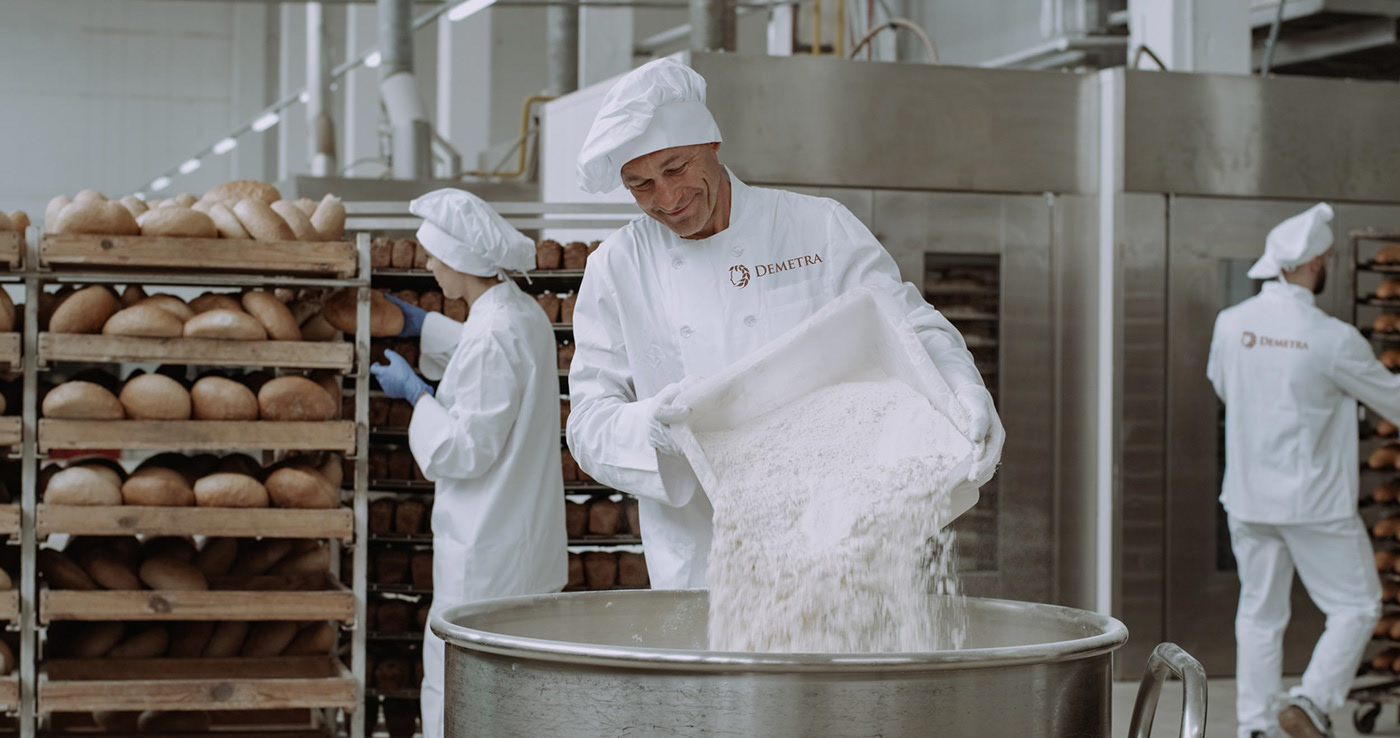
Demetra is an Italian brand of flour manufacturer. They contacted us asking for help in creating a new brand and logo. They had neither logo nor name.
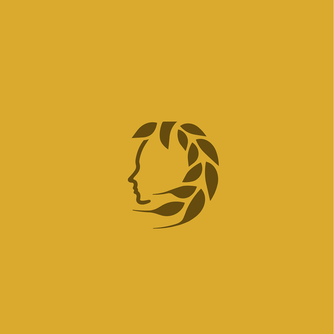
The client came up with some good ideas inspired by the antilic and their symbolism. After consultation with her, we agreed on the symbol of the female face from the profile combined with the shape of rye as hair.
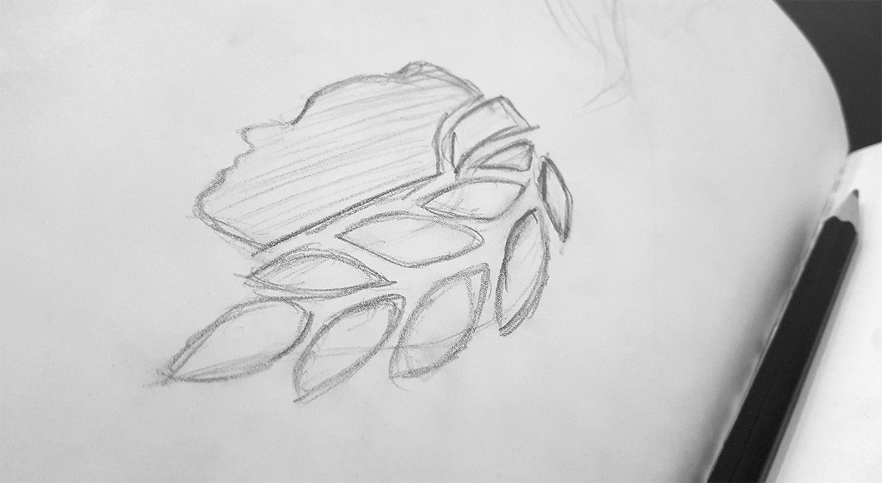
Sketching
We started by sketing the first ideas and possible ways to express the desired idea. In order to retain simplicity, we decided to make large grains of rye.
First concepts and construction.
After many variations and geometry improvements, we achieved the final shape. The client came with an additional enhancement – hair in front. This has helped to better balance colors of symbol.
In the last steps, we changed the way the “hair” is rendered so that the logo works better in square format and it was more compact.
Font and colors
The Trajan typeface was an obvious choice for logotype (text). We combined it with a dynamic semi-decorative typeface Textile. The subtle, stable type works very well in contrast with modern dynamic lettering to maintain excellent readability.
We have defined used colors in all color spaces, Pantone and films for simplicity of future use for other purposes.
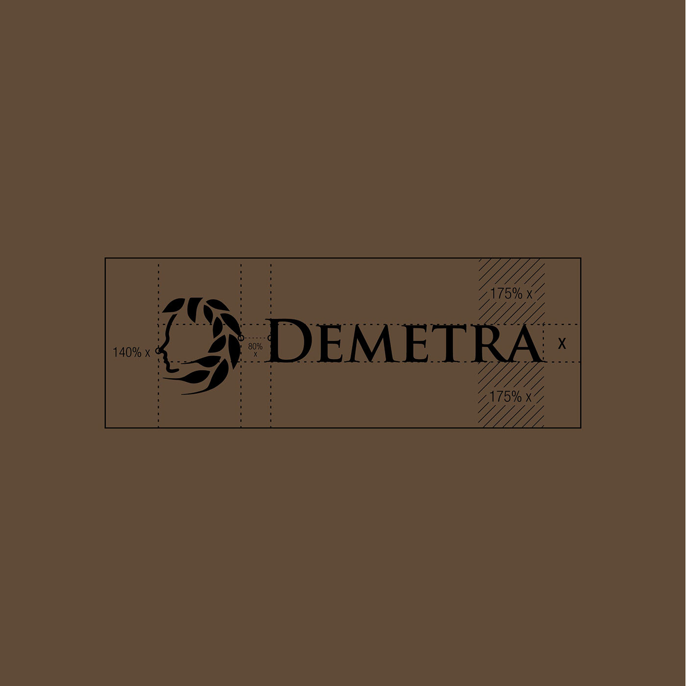
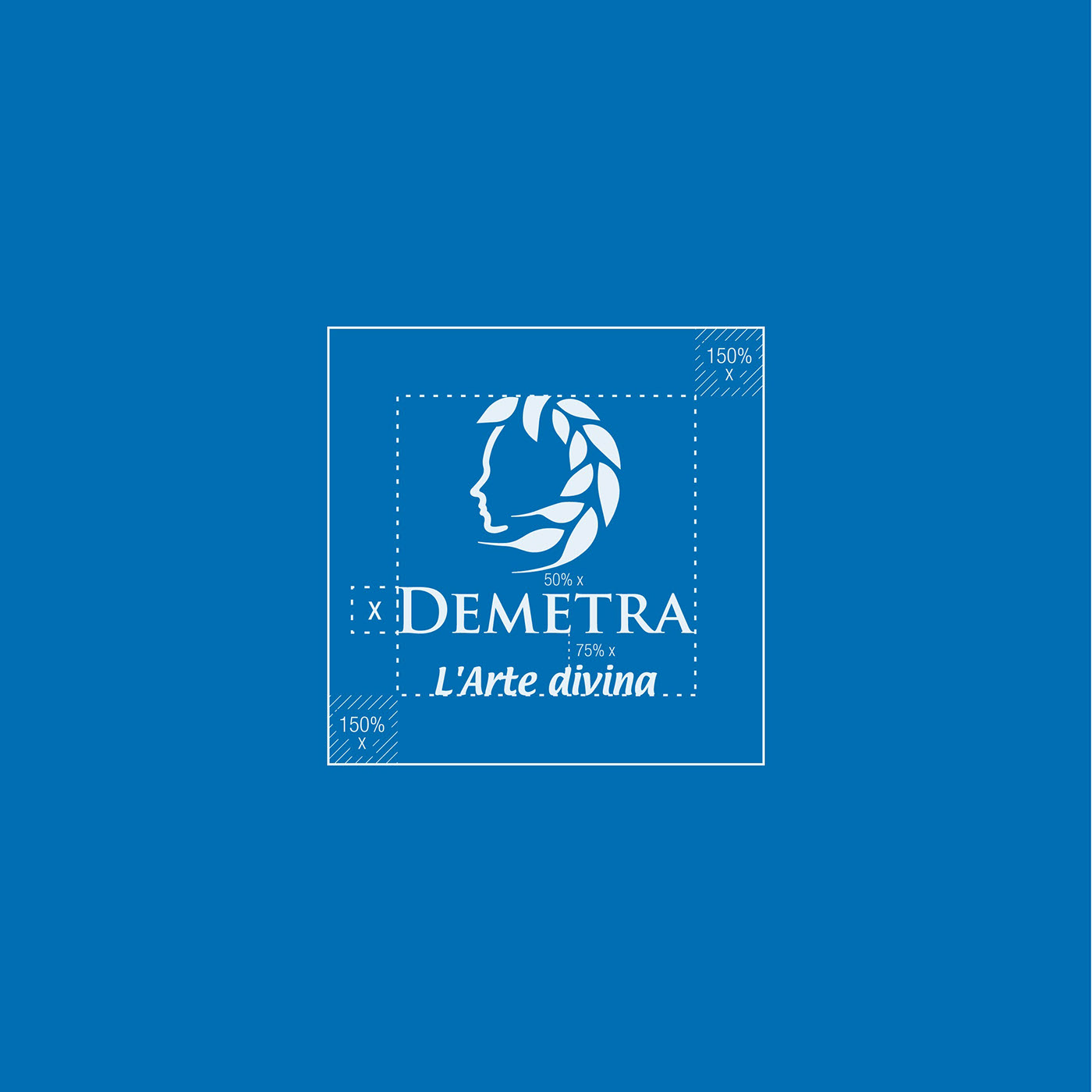
Logo safe zone
We have construction of the logo and safe zone, which should not interfere with any other element to make the logo look best. Any exceptions or changes must be discussed with the professional.
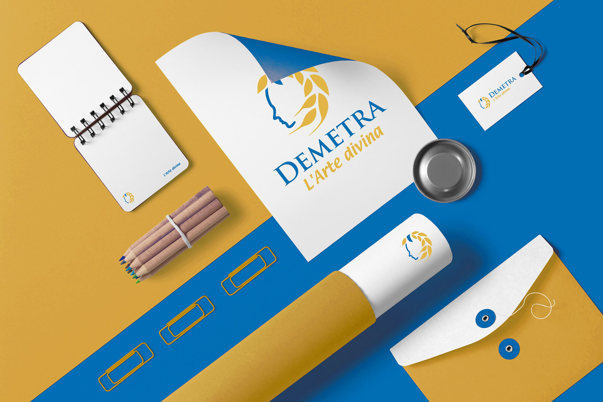
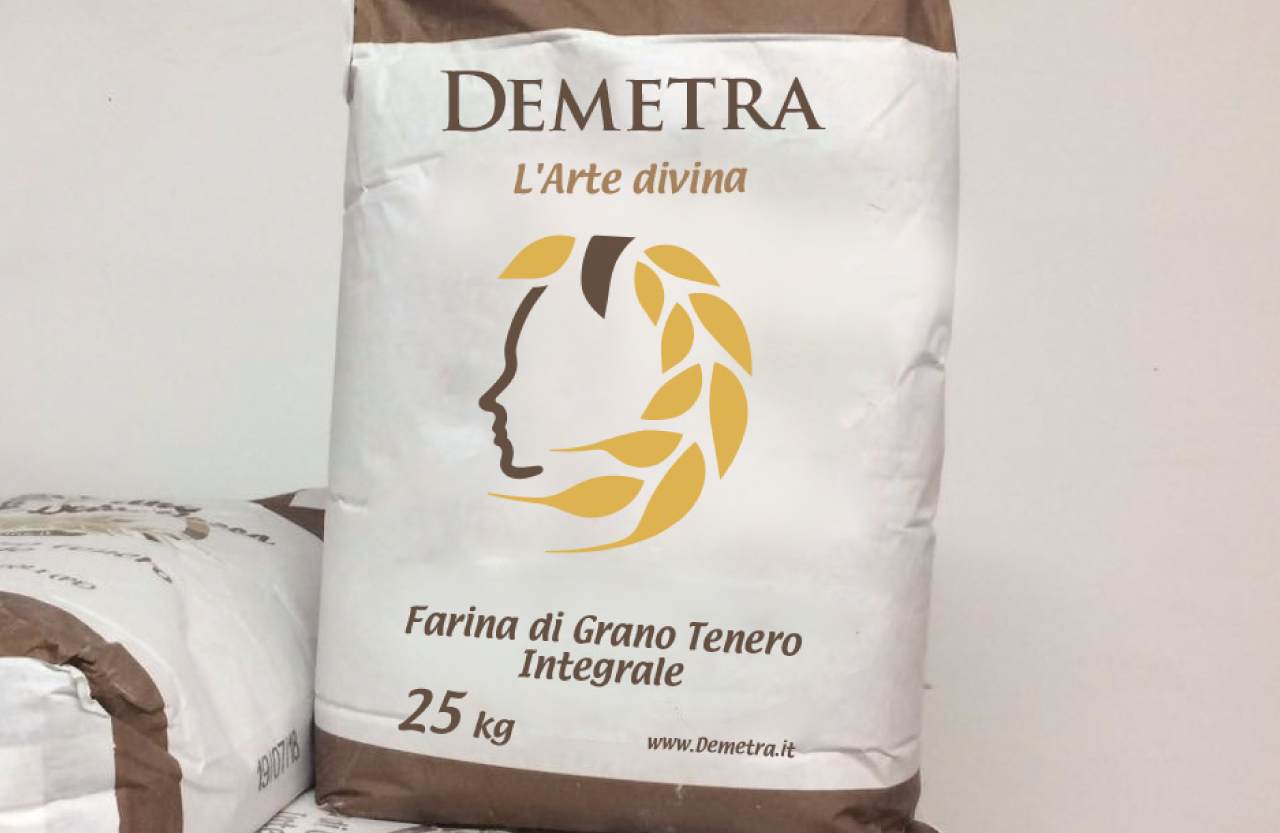
Use on bags
Before handing over the logo, we suggested how it will look on their branded bags. This is the most common point of contact with their brand name.
The client said (SK):
“Ahoj, od vreciarov [tlačiareň, ktorá vyrába vrecia pre múku] máme veľmi dobrý ohlas na logo aj slogan a vlastne celú myšlienku. Vraj je jednoduché, elegantné a zároveň pekné. Môžeme sa navzájom poklepať po pleci. Good job.”
Other logos from us