We created a new logo for a trucking company. We started with the symbolism of delivery, arrow, dynamics and package. The dynamic, sharp and geometric Montserrat font was our first font of choice, and it fit the slantiness of the surrounding elements.
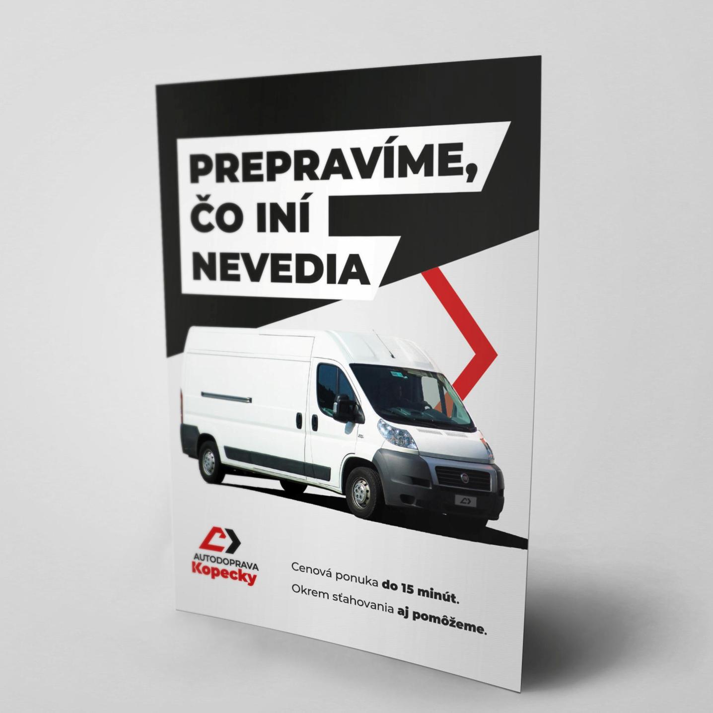
The logo has both horizontal and vertical versions. After many suggestions and gradual improvements, we have reached the final result. We immediately used the logo for client’s banners and leaflets. The dynamic diagonal elements of the logo also work great as design elements for print graphics.


