
How we helped to put a human face on and communicated the peculiar nature of a one-day clinic Chirdia. – a case study.
Chirdia is a non-state provider of health services from Trenčín, SK. Their area of expertise is one-day surgery — planned surgical performances. The client has contacted us with a request to improve the website. We first looked for the answers to the question: “What is the goal of the new site?”.
We have also talked about why the previous one did not fulfil its goal. It turned out that the problems probably are less in the graphics of the website or the legacy content administration system (CMS) but prevail in the sites’ content. After approval of the agreed budget, we again faced an exciting project.
Goal:
Increase the number of new clients interested in using the services provided by the non-state medical care centre.
Strategy:
Rebranding + 6-month online campaign
Chirdia is a medical centre welcoming the patients with a friendly environment. The atmosphere is pleasant, and the staff are helpful. There is a family atmosphere. The atmosphere of the clinic is truly unique. It differs significantly from government facilities in that the premises and equipment meet “Western” standards. However, this is not enough to separate it from the other non-state clinics.

We have created new content: lots of copy, video materials and photography to highlight their distinctions. We focused on advantages other than those of a technical nature. The client does not perform interventions you don’t also find around, nor does he deliver at the lowest prices. Above anything, we decided to build the brand Chirdia on positive emotions, including the unique charm of the client.

The most obvious difference, for the patient, is during contact with the staff. The approach of doctors and nurses is uncommon. Doctors are well educated and have a sense of humour, plus even if they are perfectionists, they can always find enough time for the patient — for explaining. This approach in other healthcare facilities, albeit commercially oriented, is far from typical.

Less clutter with the shades
The new palette is less cluttered with similar colours. We based it on the mural from the Trenčín’s graffity artist Nomad. The colour Lochinvar was chosen as primary because blue-green is typical of medical facilities. It conveys a reputation of trust, knowledge and loyalty. The secondary colour, Valencia, is the colour of Valentine’s oranges, as well as the colour associated with blood — just like any red colour.
Modern typography
Along the new visual identity came new typography. We moved from the impractical Book Antiqua Bold to more modern Montserrat. This webfont fits more into the world of medical devices and signs on its boards with its straight lines. Plus it allows us to use the font consistently on both printed and web pages.
More practical pattern
The pattern we used also had its origin at Nomad’s mural. Not unlike the colour palette, it has undergone a cleaning process to reduce the feeling of shape inconsistency and overcrowding. a reference to his artwork and related to the previous visual identity, we designed the pattern of health-green and brick-orange stripes — the most notable element of Nomad’s mural.
Photographs of beaming staff and smiling patients
The graphic design of the project is meant to be minimalistic, modern flat and clean Hence, good photographs form a significant part of the visual identity of Chirdia. During photo and video shoots for the client, we focused on emphasizing pleasant and smiling staff situated in the family environment.
* Move the slider to compare the logomark and logotype now / before.
New logo
The logo of the Chirdia Clinic underwent a significant transformation. The client insisted on using the local landmark — the tower of Trenčín’s Castle. The darkest typeface of the Montserrat family replaced Book Antiqua Bold. Book Antiqua Bold. The change of typeface delivered a close visual match toward the font used on the website. For a touch of originality, we have customized the shapes of the letters in the logotype.
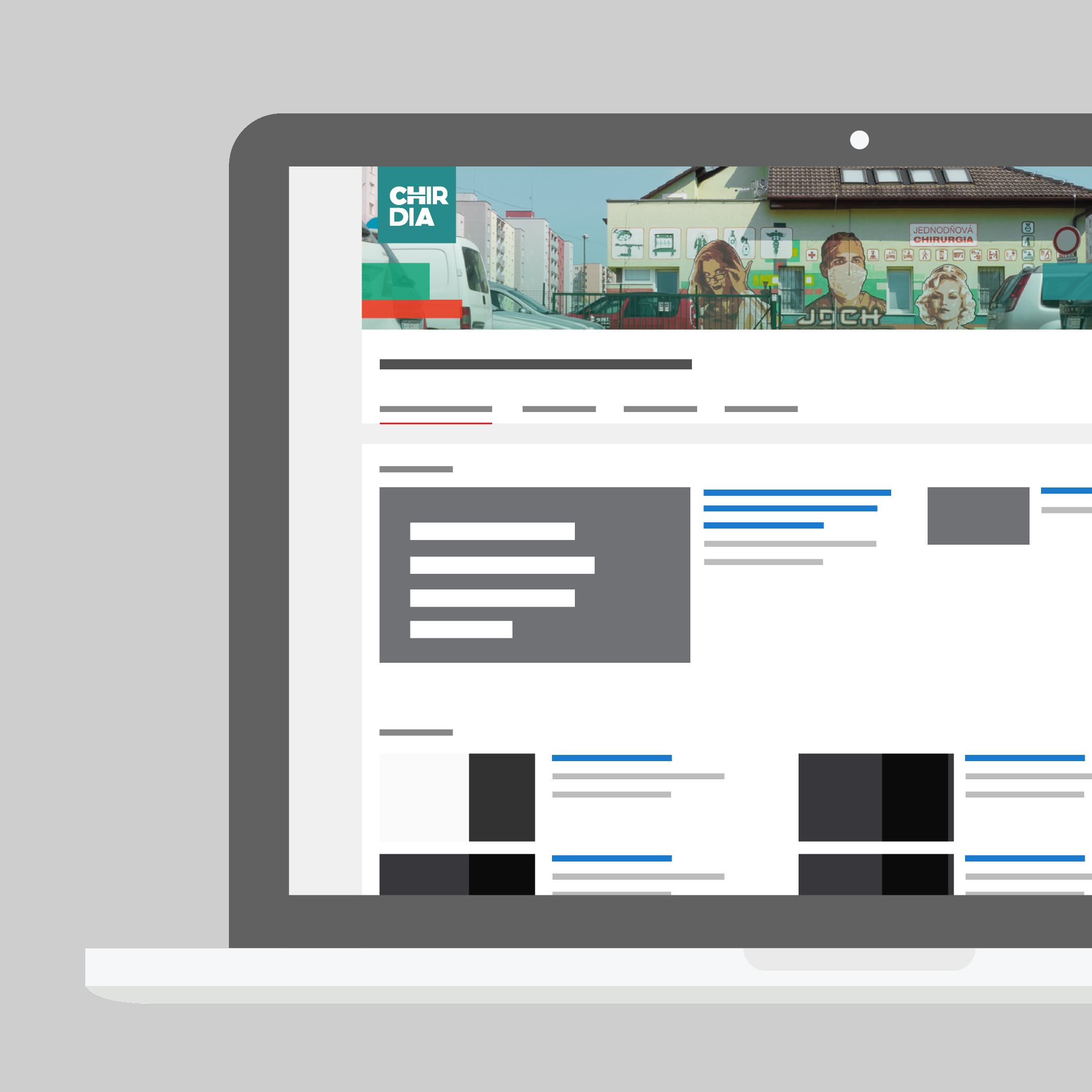
Website
The rebranding brought most of the changes to the Chirdia’s website. Our goal here was, besides those as mentioned earlier, to maintain as much connection as possible to the previous one. From the Nomad’s mural, we retained the rectangular graphic elements. The site displays the newly redesigned logo, and the colour palette should look familiar to the returning visitor. The most significant difference here, nonetheless, is the quality of the new copy and the photos. Based on extensive interviews with Chirdia’s staff, our copywriters have created it’s content anew.


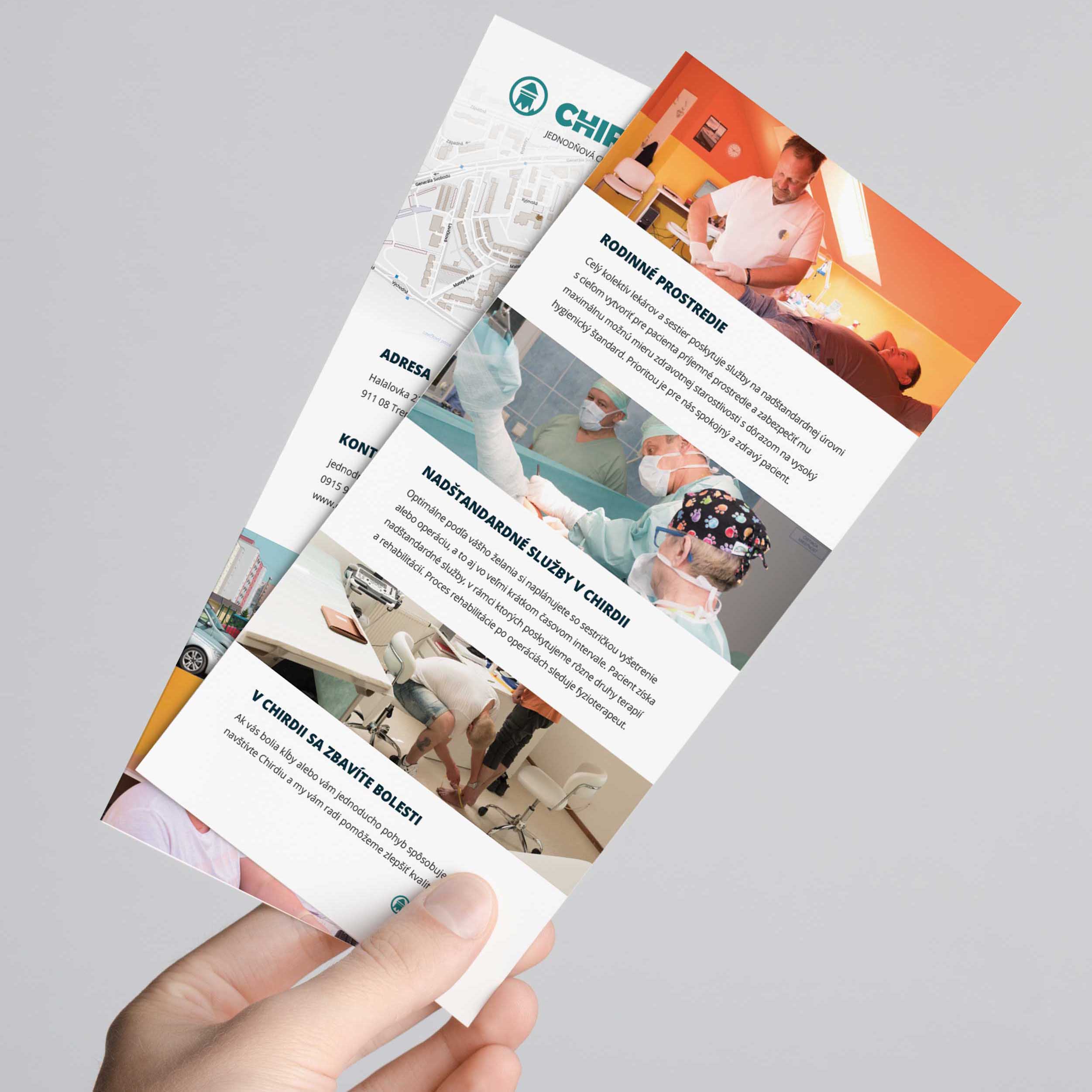
A leaflet outlining a one-day clinic's experience for the patient
General practitioners and orthopaedics have received leaflets to hand over to patients. They outlined a one-day clinic's experience for the patient and stated their difference compared to the state-managed health facilities.
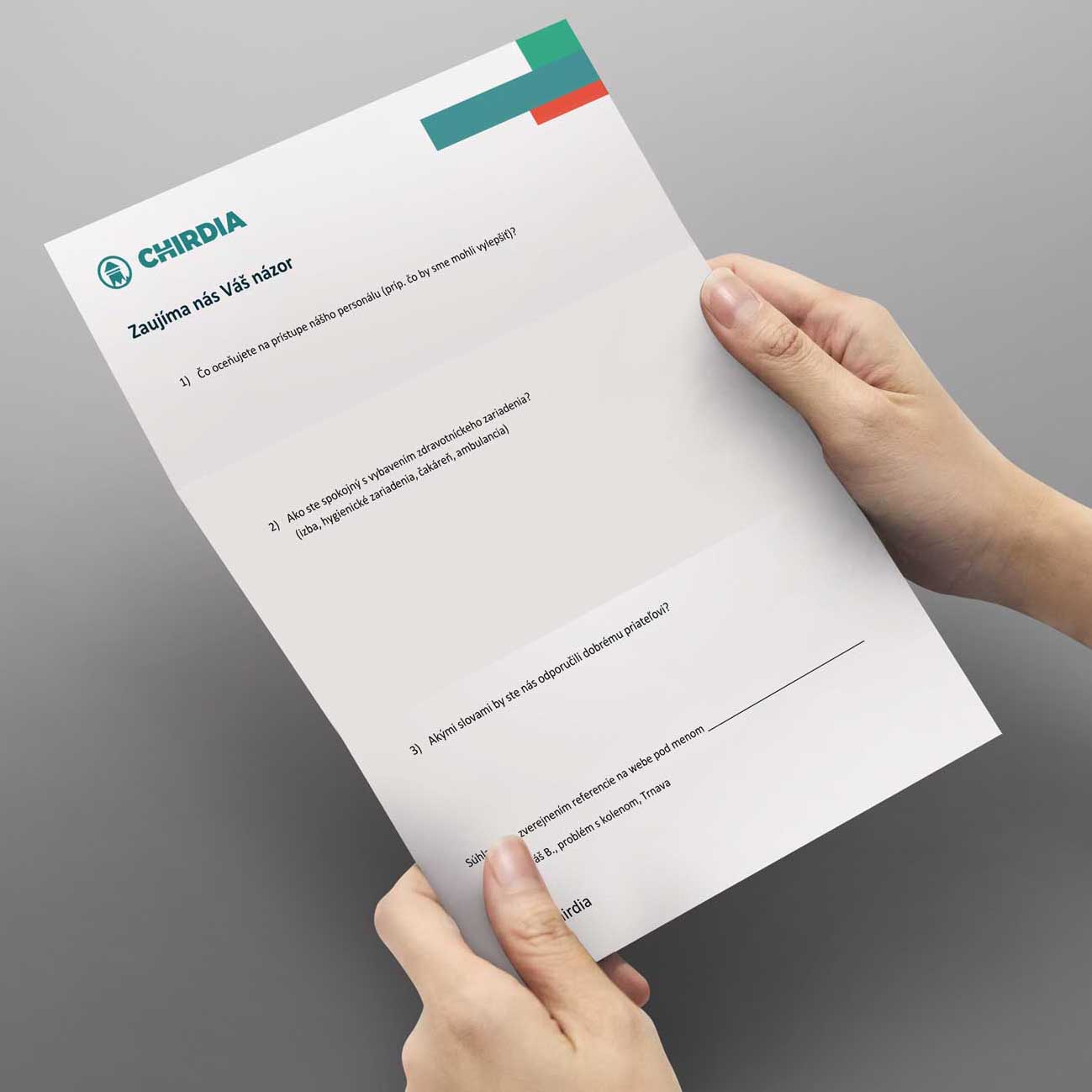
Obtaining feedback from patients
For feedback, we have suggested creating questionnaires — for getting feedback from patients. These ought to be regularly collected, evaluated and have an impact on the next campaign. These ought to be regularly collected, evaluated and have an impact on the next campaign.
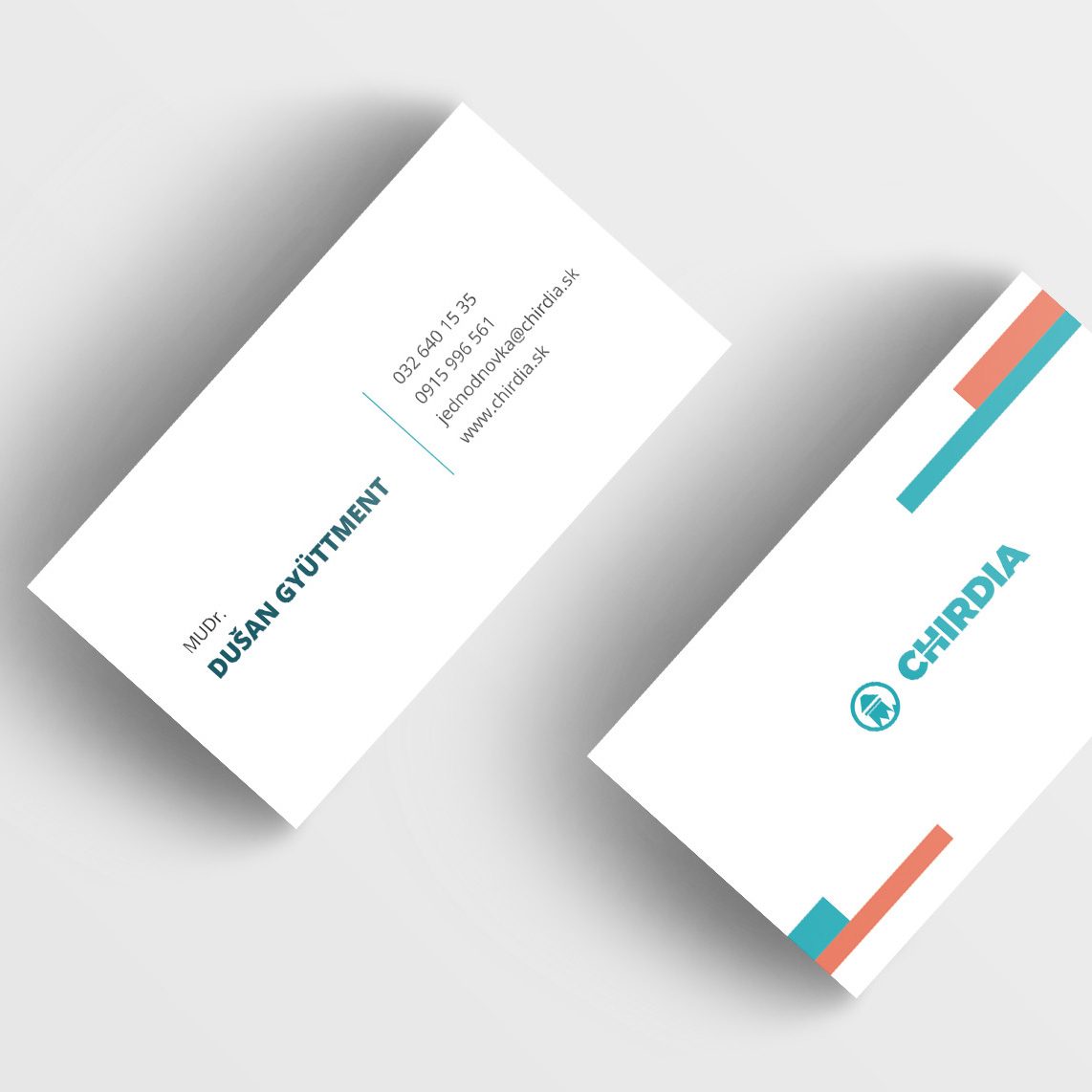
New business cards
We have also applied the redesigned visual style on to the Chirdias's mercantile; in this example, the business cards. In the future, all printed materials must meet the criteria of brand identity.

Facebook page Chirdia
The campaign also included a Facebook page for the client. The graphics were made to adhere to the brand identity.
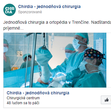
Facebook post preview
The Facebook campaign also included the creation of content and its continuous publication.
Chirdia's video channel
We've created a new YouTube channel featuring video spots of the staff and happy patients.
Animated logo for video spots
We put an extra effort into the making of a set of animated elements for video transitions. We needed them to separate the parts of the story. The animation of the new logo was where we put the most significant emphasis. Animations were not based on templates. Work on them began with sketches, visual script later on, and finally commented on and approved by the client.
12
New video spots
20+
Pages of a new copy
600%
Increase in site traffic
+1800
New Facebook fans

* Website traffic for the first two months of the campaign (Lochinvar; green), compared to the previous two months (Valencia; red).
We have planned a 6-month campaign on Facebook. A large part of the potential client base is using this social network. A large part of the potential client base is using this social network Twenty-one days after the start of the campaign, at the time of writing, we’ve seen a gain of 1135 fans. At the time of this study, these were the results of less than one month of a campaign. Patients are already getting used to reaching the clinic via messages, asking questions, and the staff is responding to them. They are sharing their experiences with the clinic on Facebook.
We run an online (PPC) campaign on Google alongside the Facebook one. Before efforts as mentioned earlier, the average monthly traffic on the website was 290 people, by the time of writing this article, it was 2000+ visitors a month — 600% increase in site traffic. An immediate jump in website traffic is also shown in the attached graph.
Result of cooperation
-
- Redesign of the Chirdia logo
- New website
- New content for the website
- Professional photography of the staff and premises
- Virtual tour of the one-day clinic
- The leaflets distributed to GPs.
- New business cards
- Graphics for YouTube channel
- 12 video spots, for various media
- Graphics for Facebook page
- 6-month campaign on Google and Facebook
- Patient Feedback Form
Entrust re-branding or creating of a new brand into our hands. We will take care of everything.
Contact Us