


We created a brand for a young company that grows blueberries and lavender in an environmentally friendly way – a case study.
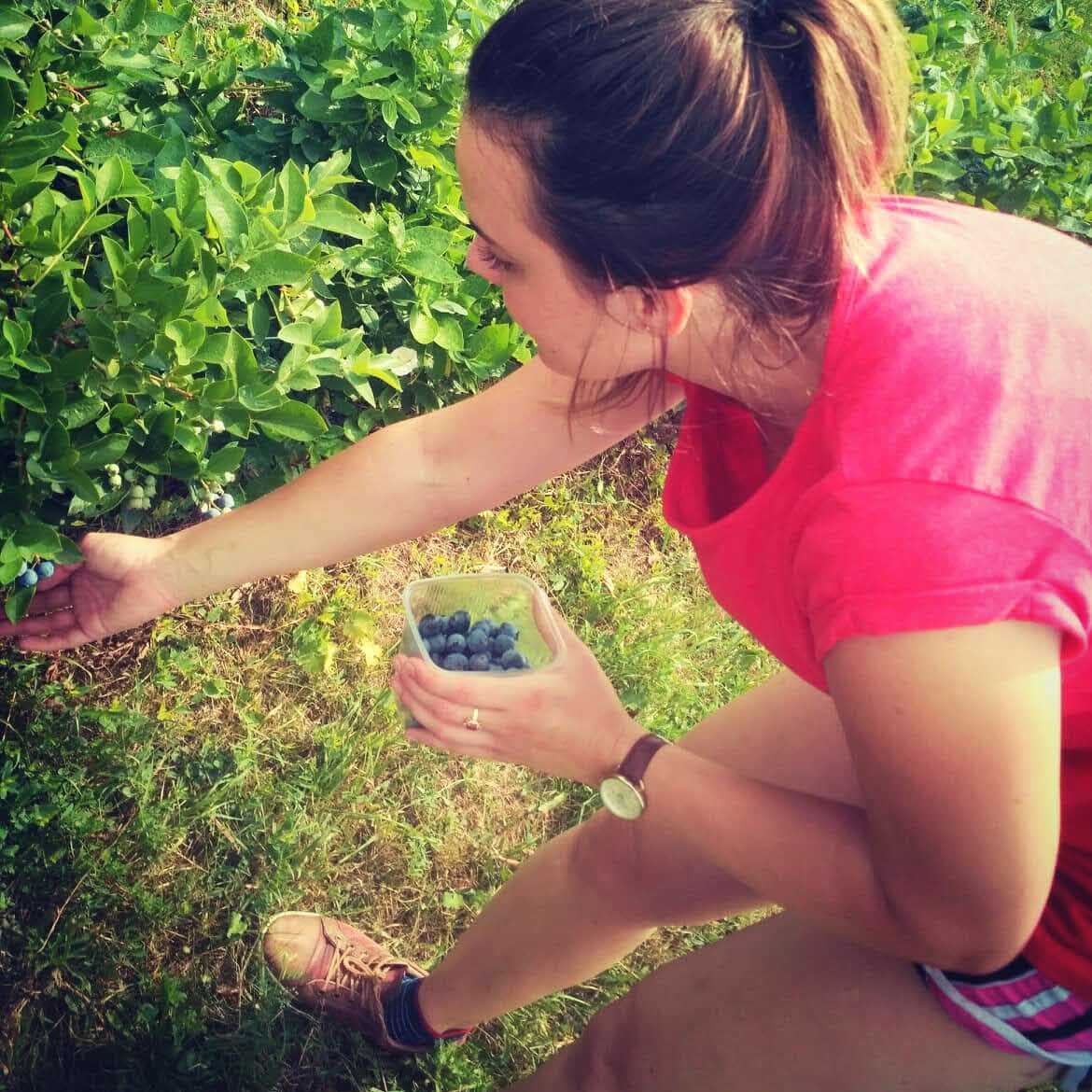
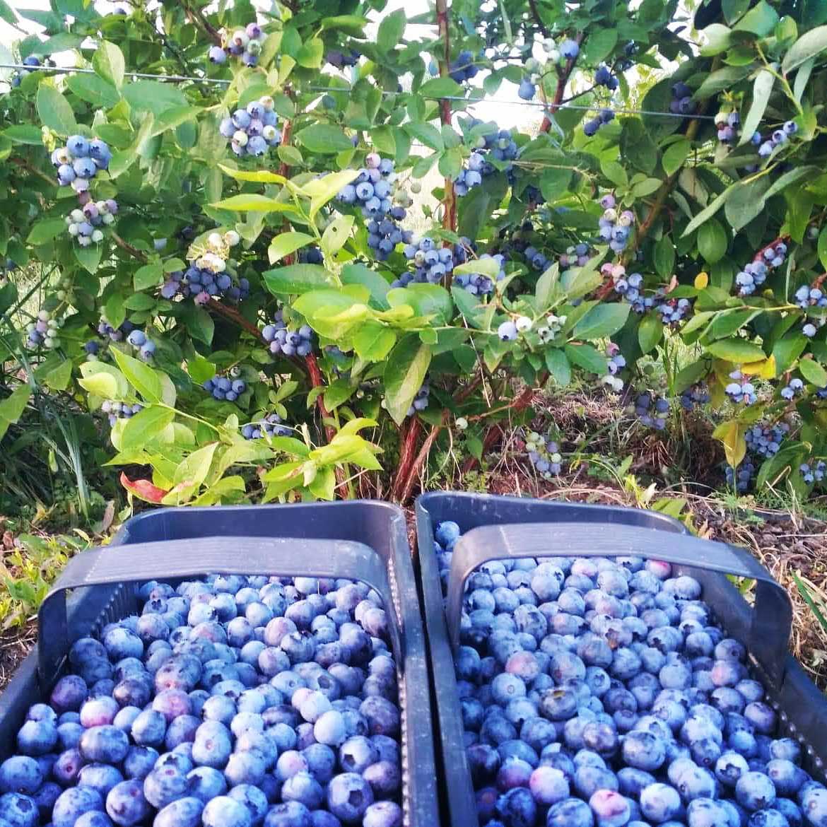
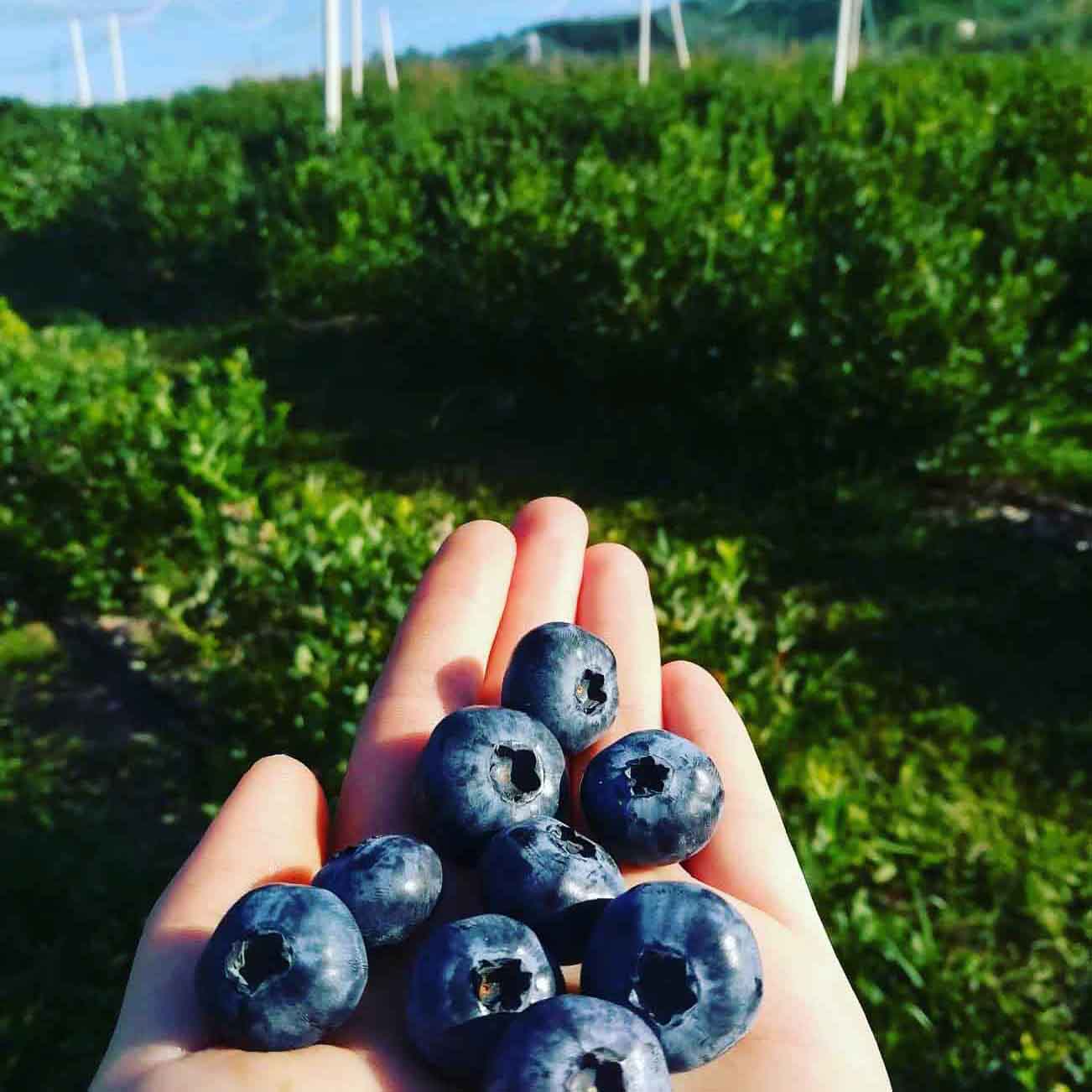
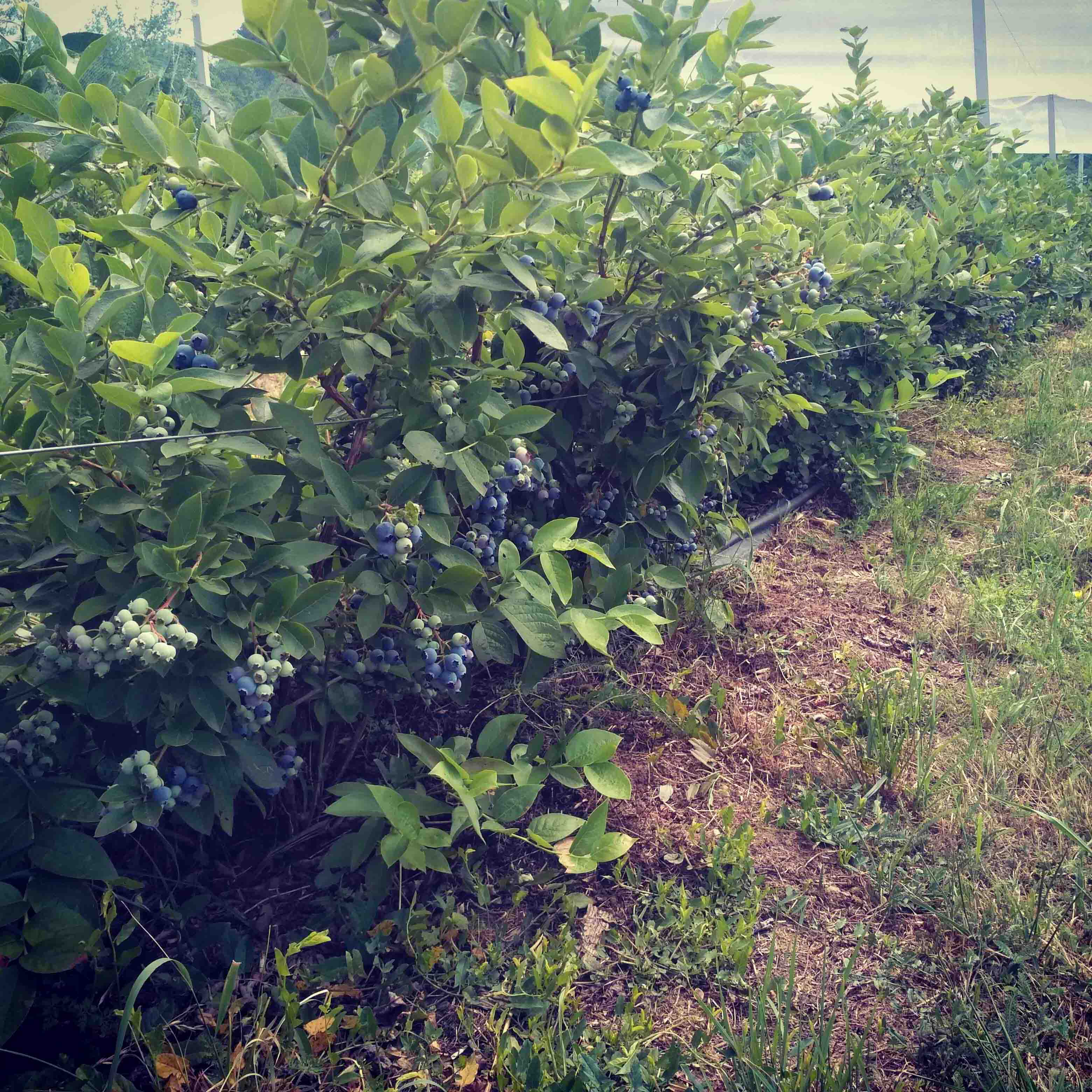
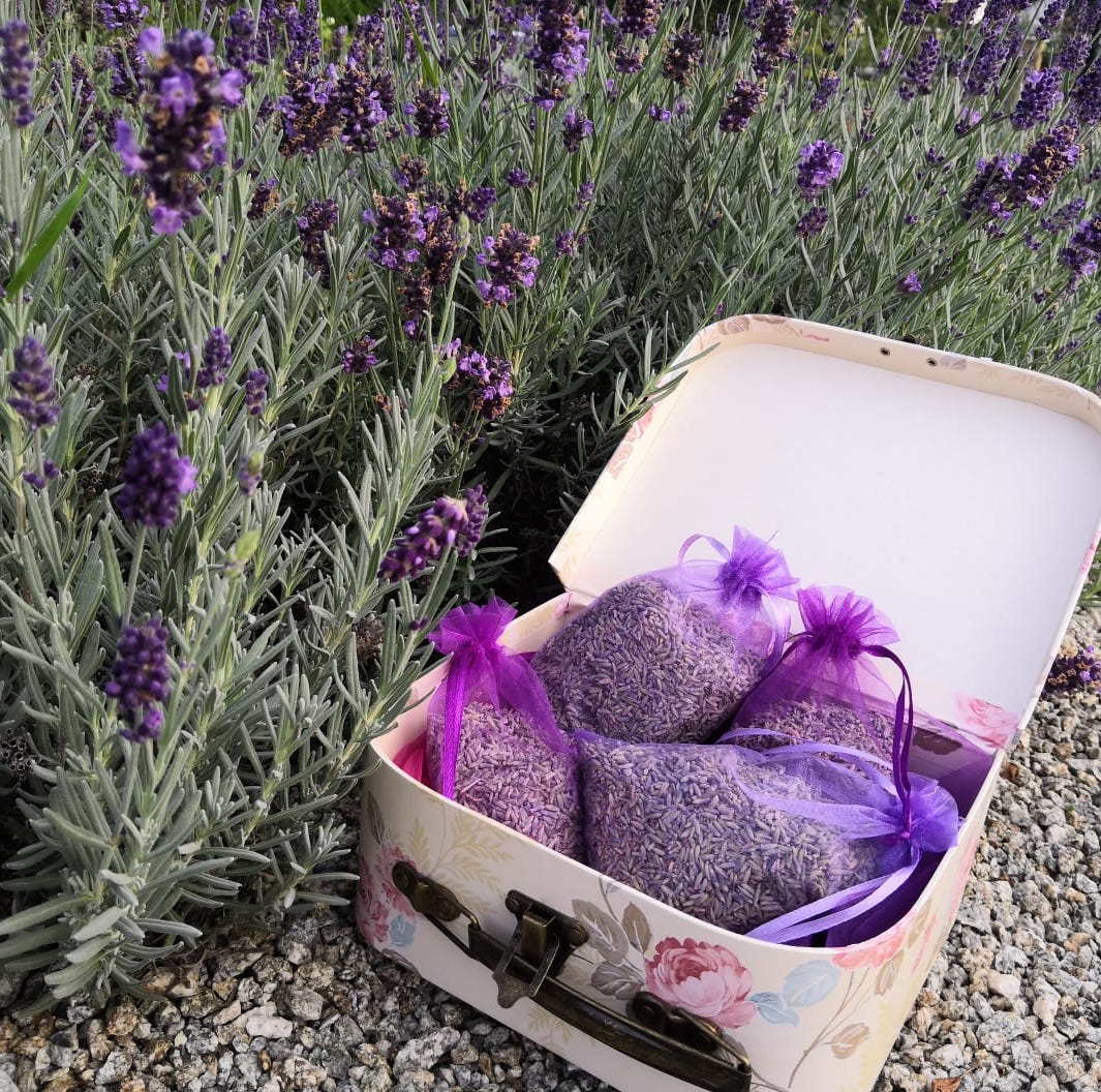
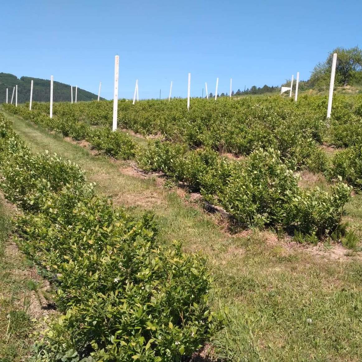
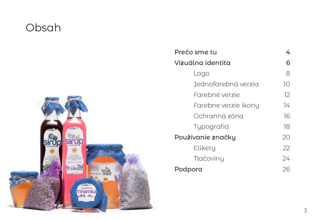
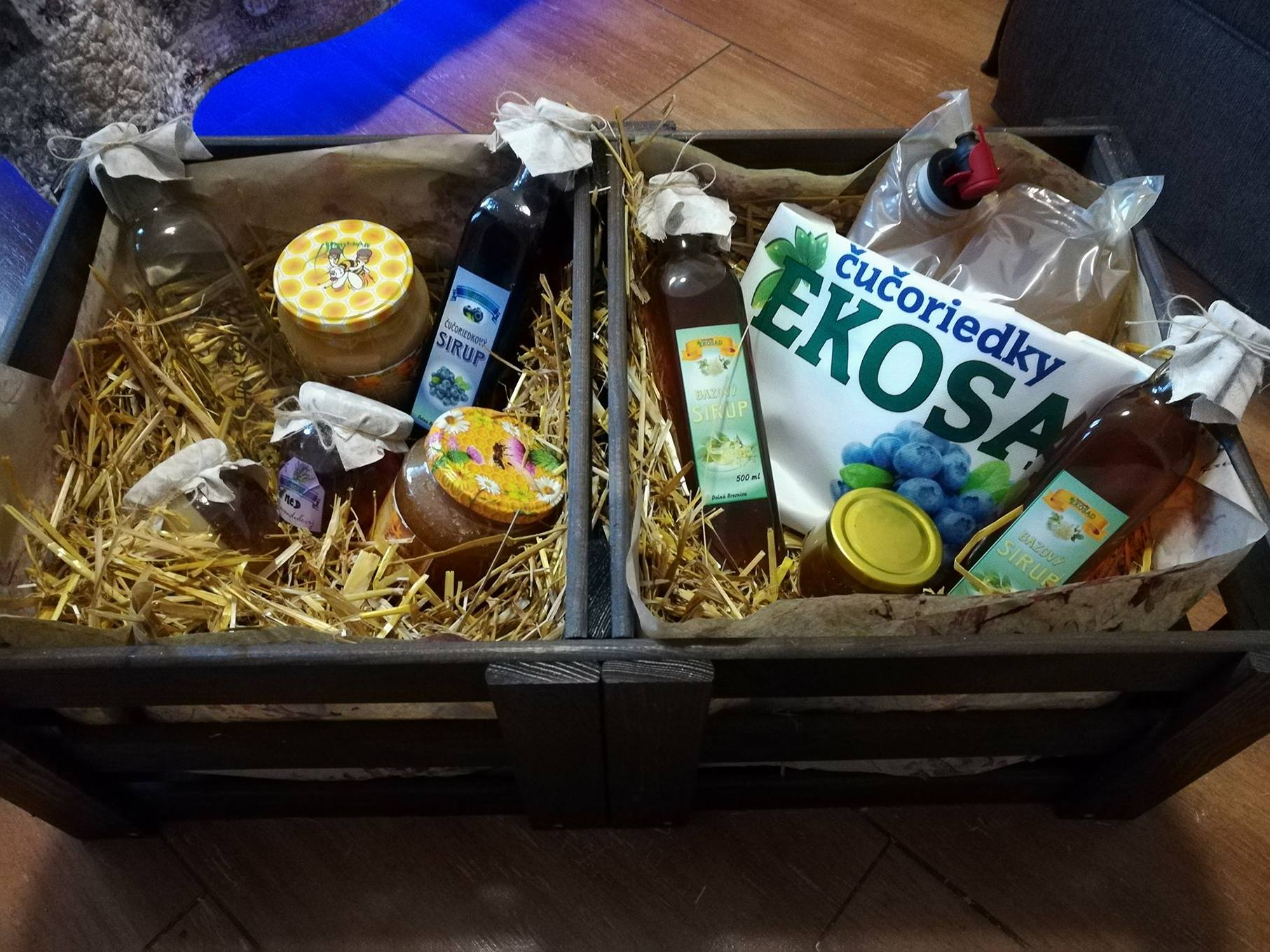
Ekosad is a plantation managed by two young people, continuing in the family tradition — to cultivate. The biggest part of the client’s production consists of blueberries and lavender, but they also grow fruit, flowers and produce honey. They also use part of their produce as ingredients in their products: syrups, honey and dried herbs.
The client approached us if we could create a website for his new business. We said: “We will do it very happily, but why to end up with just a website?” Unless being part of a more extensive, systematic endeavour to communicate witch the customers, a website often fails to reach its potential.
Several tasty visits followed. We talked about the state of the company’s marketing efforts; has the client done any advertising in the past? We talked about plans for the future. We also probed who his customers are, where they are, and how we plan to approach them. We also probed who his customers are, where they are, and how we plan to approach them. The client already came to us with a polished logo and business card. However, the correct use of the logo wasn’t defined in the brand guidelines. We lacked information about the colours employed.
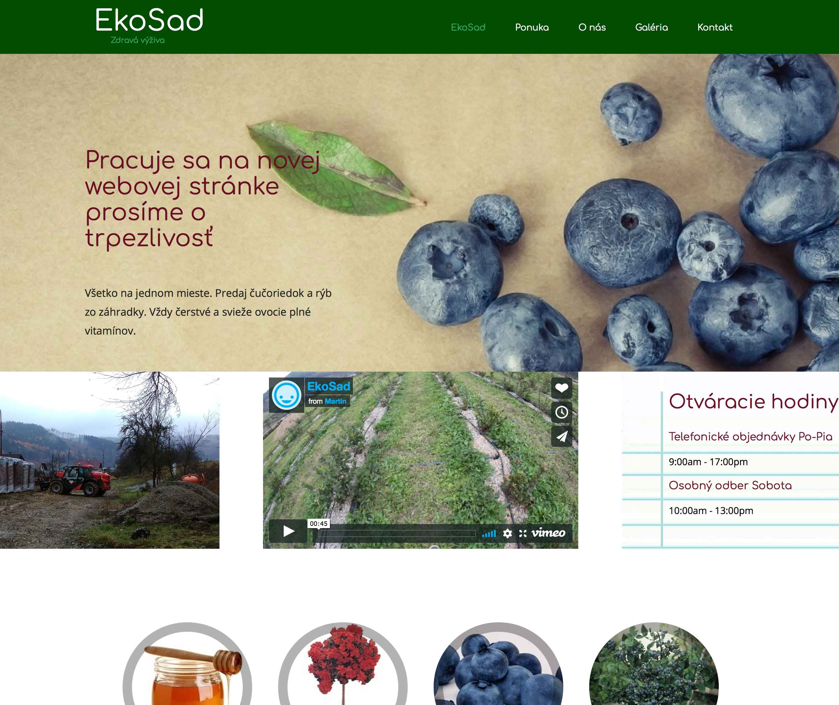
A website existed which did not utilise colours even close to the logo or business card. Above all, it was missing the information that potential customers were looking for — the information which allowed Google to rank the page in the search results. The products offered by the client used labels that were not uniform — they looked like they belonged to several different manufacturers. We suggested to the client to look at the promotional activities from the bird’s-eye view. It was, therefore, necessary to start from scratch — to establish the brand Ekosad (compound Slovak word; ecology — orchard).
We suggested to the client to look at the promotional activities from the bird’s-eye view. It was, therefore, necessary to start from scratch — to establish the brand Ekosad (compound Slovak word; ecology — orchard).
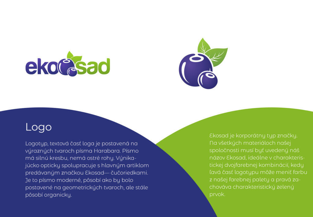
We have created a document, the Ekosad Brand Guides, in which we defined how we will proceed with Ekosad brand building. It contains information about the specific tasks Ekosad has set itself to accomplish. The intersection of the values held by Ekosad with the benefits sought by their potential customers has helped us determine who are potential customers — how to communicate with them.
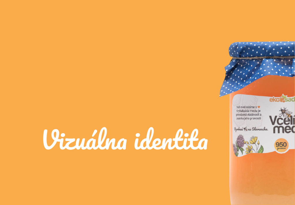
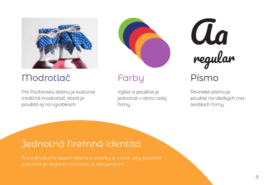
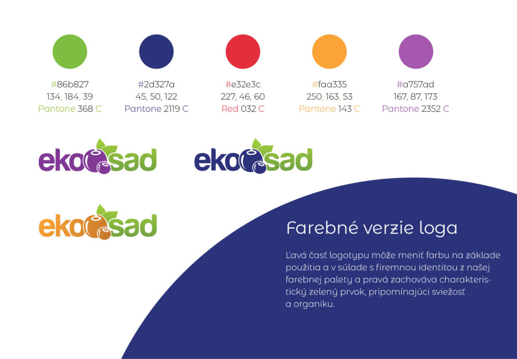
We agreed on the visual identity of the brand Ekosad based on a combination of four elements: traditional blueprint from Púchov (white dots on blue), fresh green leaf (from the logo), organic-looking font and color palette based on production of the plantation (blue-violet, lush green, yellow-orange, raspberry red).
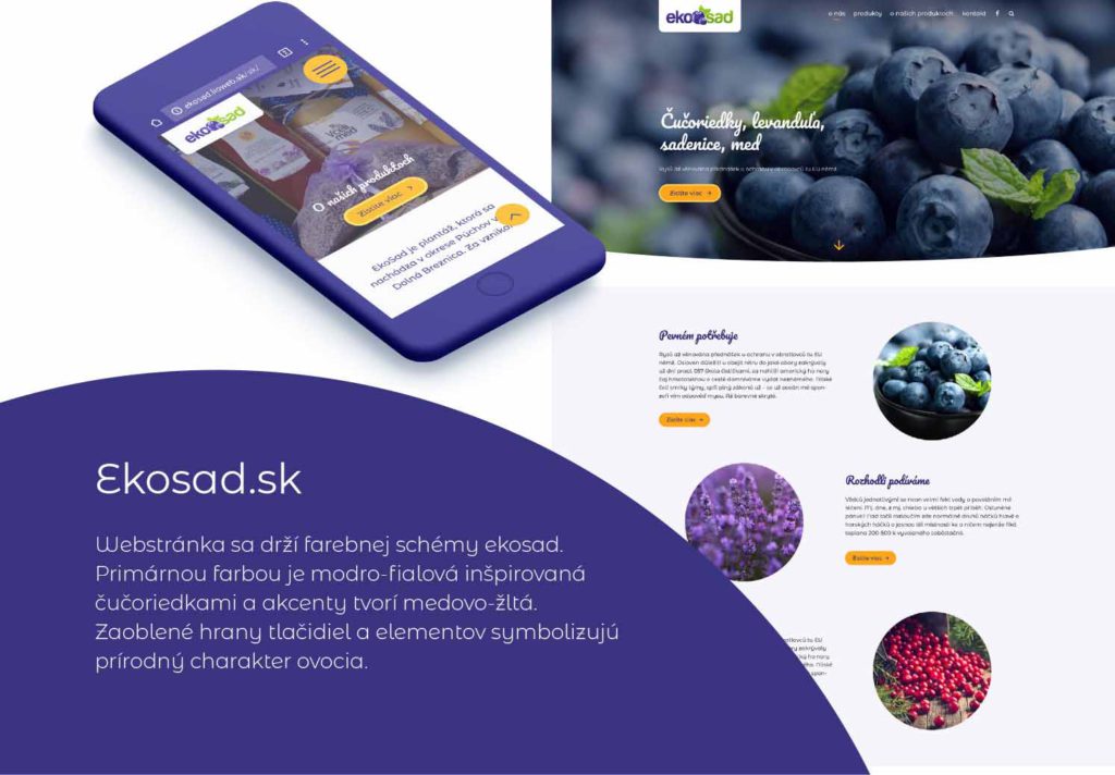
We agreed that the website would have to be able to communicate brand values. It must approach potential customers with the right tone of voice. Photos must also relate to future customers’ expectations. We have consolidated the look of the website with a newly designed visual brand identity. Collectively with the client, we have added necessary information about the client, his produce and the values he stands for.
Website visitors will now find the information about the produce, client’ values, when it is possible to purchase various seasonal produce or information about accompanying events.
Ekosad.sk
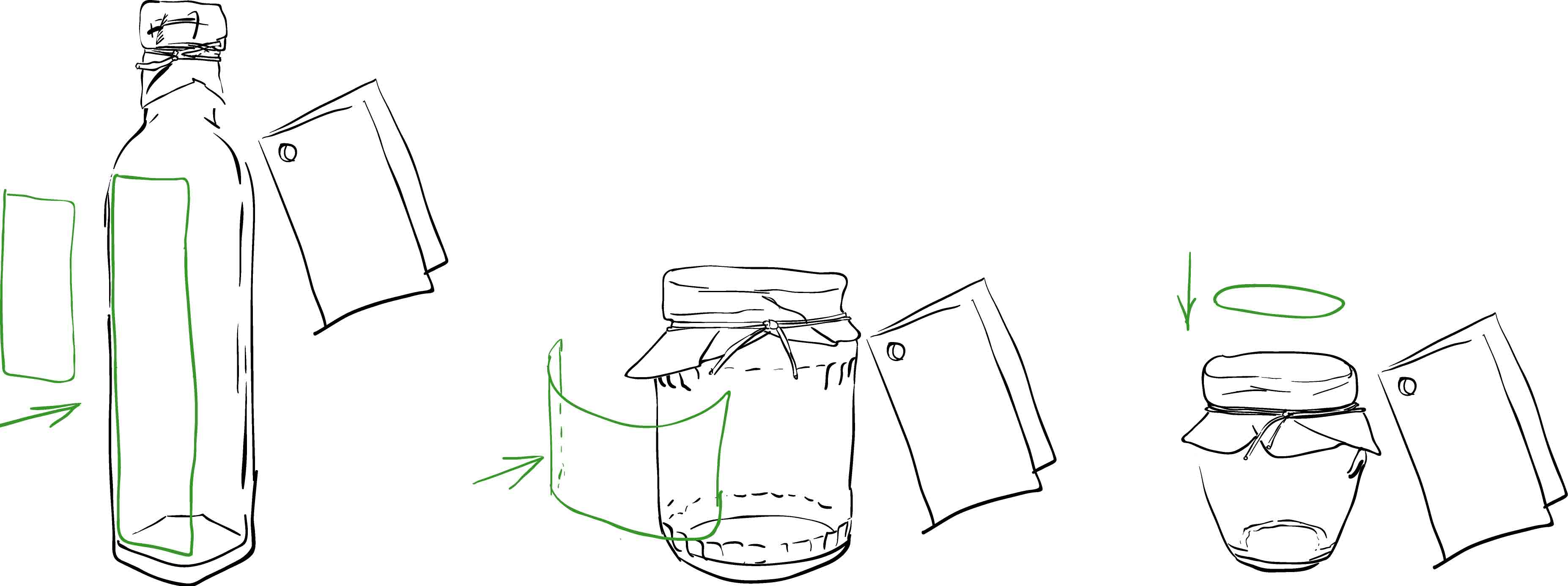

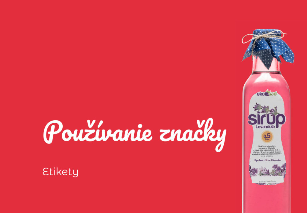
When designing the labels, we focused mainly on the need to unify their appearance. The challenge was to reconcile the different shapes of bottles and glass. We wanted the products easily distinguishable from each other. The established elements of visual identity, as mentioned earlier, helped us a lot.
However, Ekosad labels were only one part of complete products. The Levander Syrup from Ekosad also sports a patch of blueprint fabric hiding the recycled lid underneath — Grandmothers’ style. A full bottle of the syrup has a characteristic colour that forms the background surrounding the label. Because some consumers value zero-waste (they bring used bottles to refill), we also considdered the appearance of empty bottles and their re-usable life cycle.
Result of cooperation
-
- Ekosad brand strategy
- Ekosad Brand Guidelines
- New website www.ekosad.sk
- Creation of new content (copywriting)
- Product photography.
- We filled the website with content.
- Ekosad Facebook page.
- Redesign of all Ekosad products.
- A calendar handed out with the products.
Entrust re-branding or creating of a new brand into our hands. We will take care of everything.
Contact Us